Author: IanWang

I'm currently a postdoc in Organismic & Evolutionary Biology at Harvard University. My research focuses on investigating how the interactions between species and their environments shape the evolution of genetic and morphological variation.

Does This Dewlap Go With My Signalling Environment?

Geographic variation in dewlap coloration in A. distichus on Hispaniola (from Ng et al.)

Animals regularly need to communicate with one another (both within and between species) and have developed a variety of signals, some quite elaborate, for doing so.  In some cases, we see extensive variation in these signals across the range of a species, raising the questions of how and why this occurs.  As Julienne Ng, Emily Landeen, Ryane Logsdon, and Rich Glor explain in a new Evolution paper, there are essentially three possible explanations.  Signals may diverge due to random drift, the pressures of sexual selection, or adaptation to local signaling conditions.  The latter possibility, in which signals evolve to match local habitat or environmental conditions, is a particularly interesting scenario.

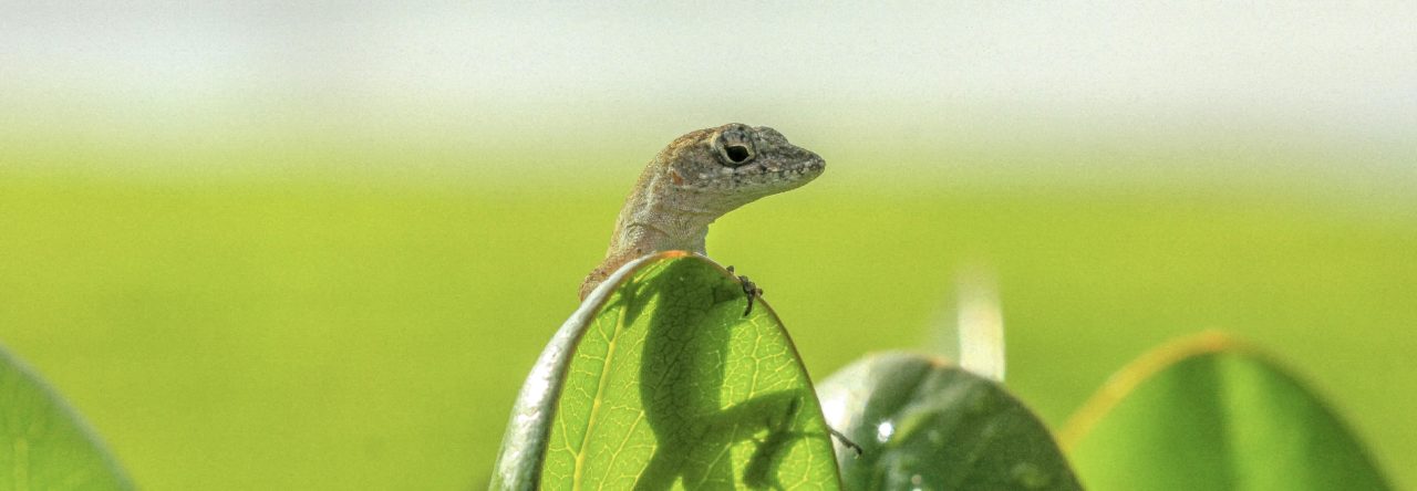
In their study, Ng et al. examined geographic variation in the dewlaps of Anolis distichus, which vary from yellow to orange/red across Hispaniola.  They recorded reflectance spectra from the dewlaps of 36 different populations, extracted annual precipitation, surface temperature, and percent tree cover variables from GIS data layers, and tested for associations between dewlap and environmental variation.  Because dewlap variation could potentially be influenced by the relatedness of two populations in space or through shared ancestry, Ng et al. also corrected their data sets to remove the effects of spatial autocorrelation and phylogenetic relationships, important extra steps that will hopefully become commonplace in future studies.

It turns out that in drier habitats, A. distichus display smaller, brighter, yellow dewlaps, whereas in wetter habitats, they display larger, less bright, orange dewlaps.  Dewlaps also tended to be more orange in cooler environments with more tree cover.  Interestingly, this pattern is actually opposite that observed by Leal and Fleishman (2004) in A. cristatellus on Puerto Rico, which have brighter dewlaps in drier areas.  Thus, like any good study, this one raises a series of interesting new questions in the course of answering several others.  As Ng et al. point out, it will be interesting to see what future studies tell us about the mechanistic underpinnings of environmentally-associated dewlap divergence.

Finally, I think that the first line in Ng et al.’s paper is an especially good one: “Signals involved in sexual selection and species recognition – the peacock’s tail, the rhinoceros beetle’s horn, and the swordtail’s sword, to name just a few – are some of evolution’s most spectacular outcomes.”  Hopefully, with the impressive recent work done on its ecologically and evolutionarily important variation, researchers in other systems will take note that the anole’s dewlap clearly deserves to be added to this list too.

Ng, J., Landeen, E. L., Logsdon, R. M. and Glor, R. E. 2012. Correlation between Anolis lizard dewlap phenotype and environmental variation indicates adaptive divergence of a signal important to sexual selection and specie recognition. Evolution. doi: 10.1111/j.1558-5646.2012.01795.x

Leal, M., and Fleishman, L.J. 2002. Evidence for habitat partitioning based on adaptation to environmental light in a pair of sympatric lizard species. Proc. R. Soc. Lond. Ser. B 269:351–359.


Map of Life

Distribution and occurrence data for Anolis sagrei from the Map of Life.

Ever wonder where you can find Anolis gorgonae?  Or what about Anolis proboscis?  How about some 25,000 other species?  Well, then you might want to go have a look at the Map of Life (www.mappinglife.org).  Even just casually perusing this web database for some odd species searches can be really eye-opening.

The Map of Life is an impressive and ambitious project that aims to map the distributions of all life on Earth.  The database assembles and integrates different sources of data for species occurrences and distributions worldwide, including expert species range maps, locality information, ecological data, and maps from organizations like IUCN, WWF, and GBIF.  Best of all, accessing this information is completely free to the public.  The species distribution data are projected onto Google Earth maps, and users can select different map displays and toggle features on and off.

This is already a great resource, but the project team has plans to add even more features and more data in the future.  With the increasing use of spatial and geographical data in ecological, evolutionary, and conservation research, projects like this are going to be extremely valuable for the scientific community.

Reference for the Map of Life vision paper:

Jetz W, McPherson JM, and Guralnick RP (2012) Integrating biodiversity distribution knowledge: toward a global map of life. Trends in Ecology & Evolution, 27:151-159.

Classic Scientific Illustrations

Many stunning photos have been presented on this blog, and the recent announcement of the 2012 Anole Photo Contest is sure to draw many more.  Many of these images also grace the covers of scientific journals and are frequently used for creating vivid figures in papers.  Certainly, the ability to easily capture and reproduce high-quality photos has provided great benefits for science, but sometimes it’s also worth remembering that scientific illustration played an important role in communicating findings to other scientists and the general public.

The Guild of Natural Science Illustrators describes science illustrators as “artists in the service of science” for whom “accuracy and communication are essential,” and, while we tend to think of photography as the most realistic way to represent an image, GNSI points out that “the skilled scientific illustrator can clarify multiple focal depths and overlapping layers, emphasize important details, and reconstruct broken specimens on paper — results unattainable through photography.”

A post on this blog last year pointed to the New York Public Library’s digitization of their scientific illustration archives, and it looks like other museums are following suit.  For instance, The Smithsonian National Museum of Natural History has digitized about 6000 images from their entomology illustration archives and a huge number of images from other collections as well. There are also independent websites popping up that are collecting digital images of classic scientific illustrations on all subjects (e.g. http://scientificillustration.tumblr.com/archive and http://vintageprintable.swivelchairmedia.com/animal/animal-reptile-amphibian/).

These are definitely worth browsing if you’re interested in the history of science or just enjoy viewing finely created artistic pieces of the animals we study.

Powered by WordPress & Theme by Anders Norén